-4.gif)


Firstly, I have thoroughly reviewed all the screens in the client’s application. During this process, I identified several areas for enhancement and developed initial concepts for improving the user experience.
While I had a general vision of my objectives, I also sought to explore the approaches of other brands to similar functionalities. I examined several applications that proved particularly valuable in this context, including Spotify, Orange Flex, and Allegro.
I identified key features that I could draw inspiration from while redesigning the client’s application. I collected screenshots from these applications and described the aspects I found appealing, enabling me to present my findings to my client and facilitate a discussion during our meeting.


Furthermore, I focused on developing the information architecture for the primary functionalities. This provided a clear understanding of my objectives, significantly clarifying my vision. Based on this, I commenced designing and sketching initial concepts for the app redesign. I conducted this manually, using a piece of paper and a pencil. After that, I transformed them into low-fidelity mockups.


I also prepared a mood board to establish the desired ambiance for the final version. This activity had a notable impact on the development of the new colour palette for the application.


In the redesign of the application, I collaborated with my own small components library. Initially, I identified the font and icons I intended to use. I opted to utilise Basil Icons for this purpose. My preparatory sketches facilitated the design of the initial primary screens. From these, I determined specific paths within the application, such as adding a song to the favourites list or composing a note for a particular podcast episode.
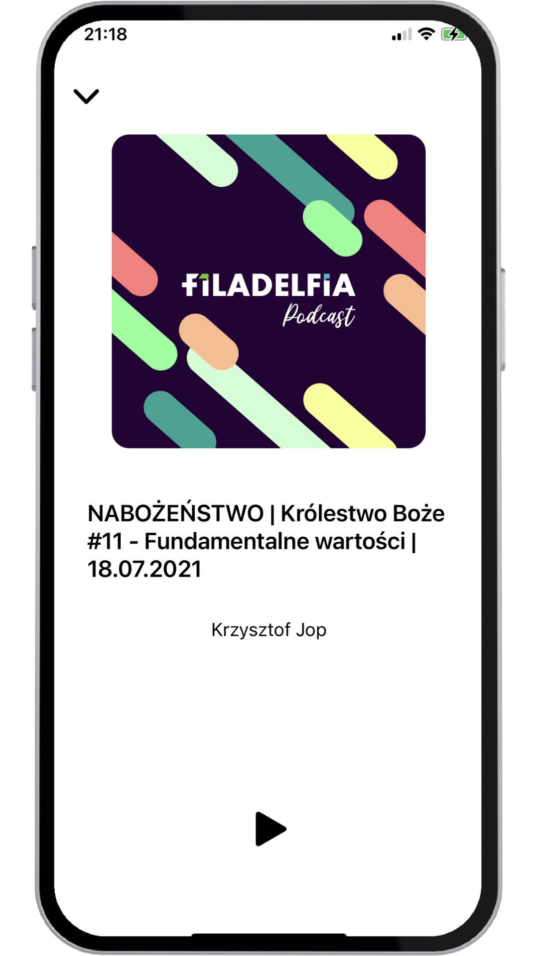
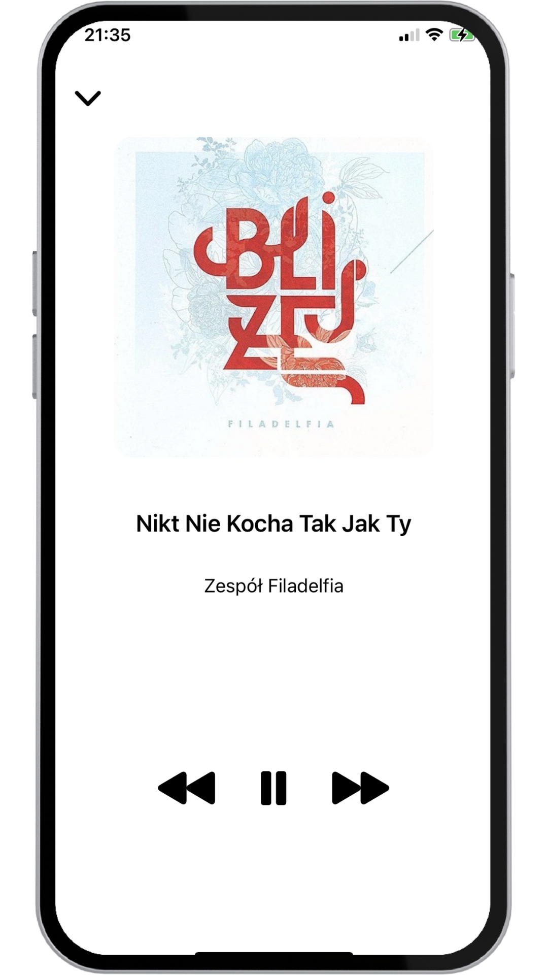
The application consisted of six primary areas:
• home screen
• the listening section
• the watching section
• the favourites screen
• the notes area
• the menu area.
The components required for the design were created during the design of specific screens. Upon recognising the need for reusable design elements, I transformed them into components. I prepared all new designs in Figma, ensuring both light mode and dark mode versions.
After discussing the final version with my clients, there were some changes to make, eg. events calendar and event reminders.


This project was based on my existing knowledge and experience. I endeavoured to make design decisions as judiciously as possible. I received mentorship from my academic supervisor at the time.
I selected white as the primary colour for the light mode and dark blue for the dark mode. My objective in redesigning the application was to enhance its usability and accessibility while maintaining adequate contrast.
1. I didn't set up a clear timeframe for the project from the beginning, but luckily my mentor at that time helped me with realising that so I did fix that. It definitely helped me to remember about such thing in the future projects.
2. I learned that even If I previously thought that I have to do everything from scratch, I actually don't have to do everything on my own and there is nothing wrong with using already developed tools or free resources eg. Basil Icons or color palettes!
3. That was my first freelance project and even if the whole process could have been more smooth, I did it!
-5.gif)